User Interface
The user interface for a regular user is deliberately simple. Unlike administrators, regular users do not see the side panel for connector management, Data Views, monitoring, or user administration. The main area for a regular user is the homepage, where filters can be defined to explore anomalies and changes in the Data Views they have access to.
In the top-right corner the user can open the contextual Settings menu. This menu contains only two actions.

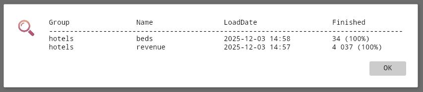
The first action, User Logout, signs the user out of the application. The second, Data Views Status, opens a dialog showing the current processing status for the Data Views the user can access. The dialog includes Data View names, the timestamp of the last data load, and the processing status of anomaly and change analysis.
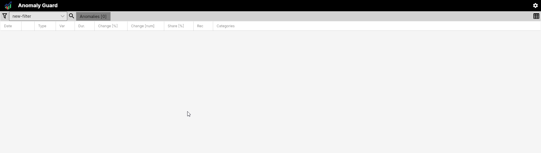
On the homepage the toolbar contains the main functionality. The first button, Filter, toggles the anomaly filter settings. The combo box selects saved filters. Finally, the toolbar contains one or two tabs that display results — either a single list of anomalies or a list on one tab with logical aggregates shown on the other.

Click Filter to open the filter settings in the left-side panel. In this panel you can define filters that operate over the set of identified anomalies across Data Views. Filters can be applied ad-hoc or saved for repeated use.
Filters Usability
AnomalyGuard assumes that users in different business roles will prepare and save filters tailored to their needs. Those filters can then be used in the main application, embedded in interactive dashboards, or accessed via the provided API as insights where appropriate.
Filter settings can be relatively sophisticated. Using the same dataset you can prepare role-specific insights for a CEO/CFO, regional managers, or specialist teams such as the data department.

After you configure the filter, click Load Anomalies. The application will query the database, process and aggregate the results, and display them. Guidance on how to set up filters correctly is provided in Setup Your Analysis.
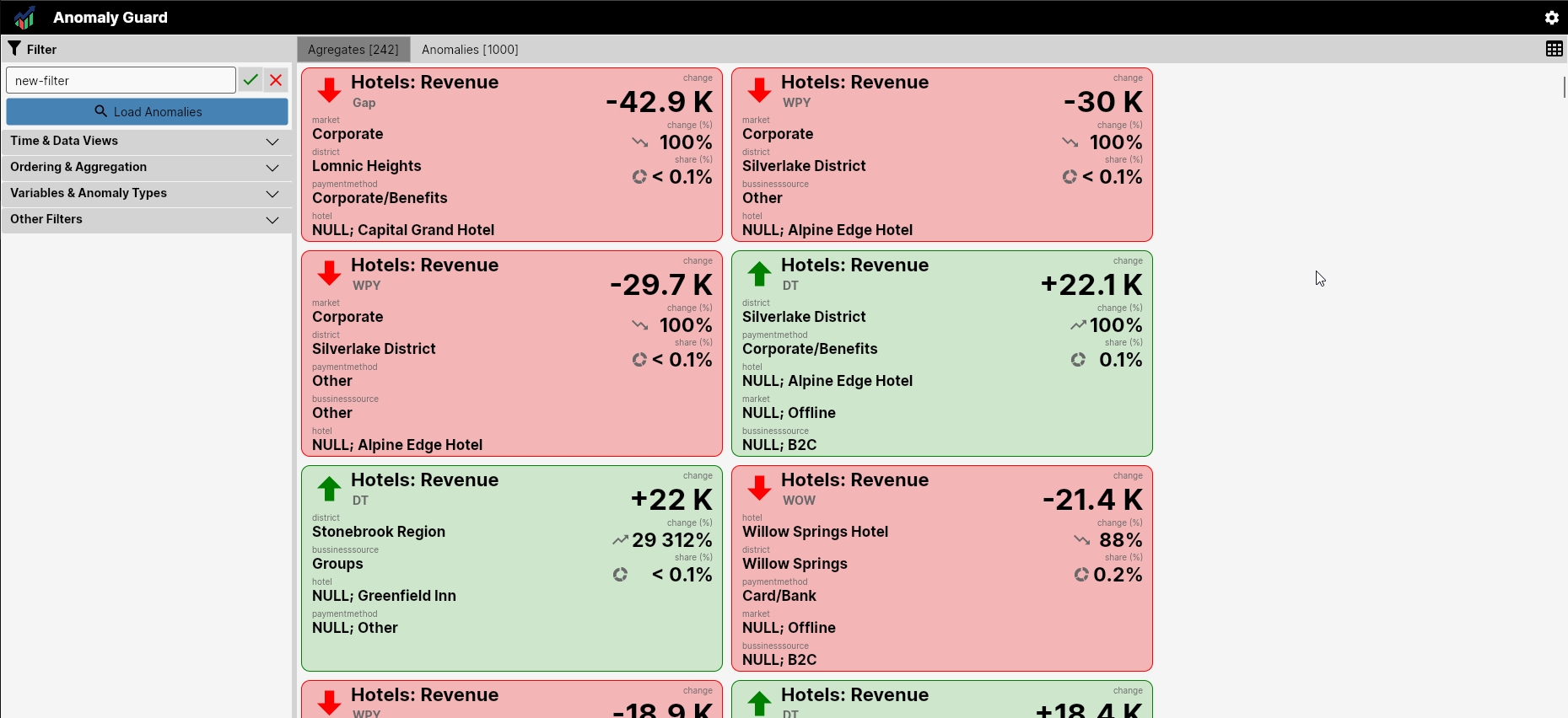
Anomalies and their aggregates can be displayed in several ways. One option is tile cards that present a compact summary of aggregated anomalies.
Aggregates can also be shown in a simple table that is easy to scan.
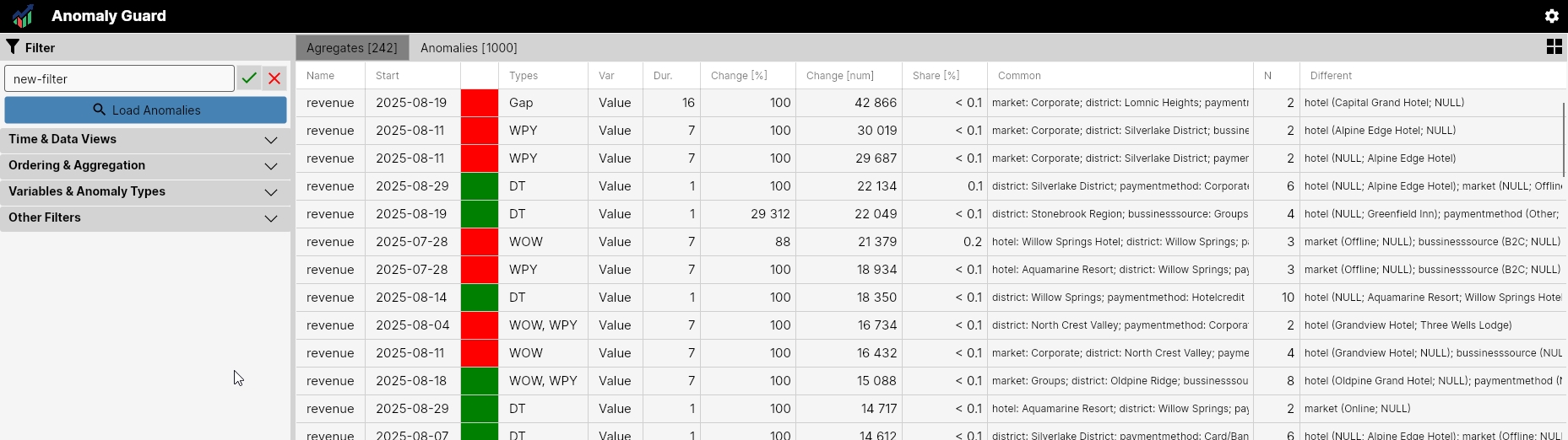
Double-click a row in this table to open the aggregated anomaly details.
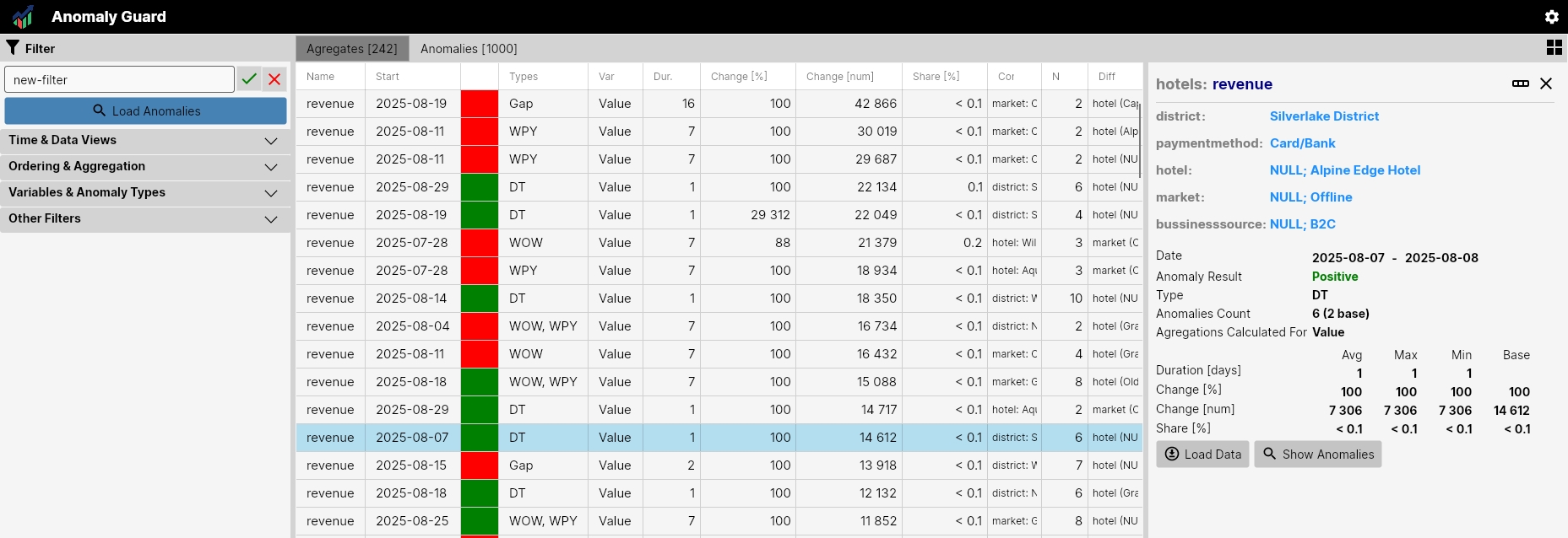
Individual anomalies can be displayed in their own table as well. Double-clicking a row opens a side panel with detailed information. The panel shows the full set of available information about the anomaly and allows viewing the underlying data for the corresponding combination of dimensions.
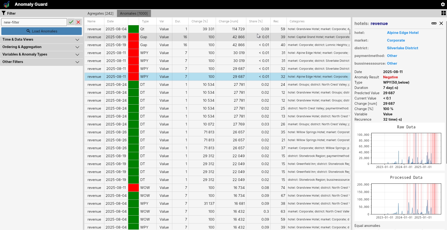
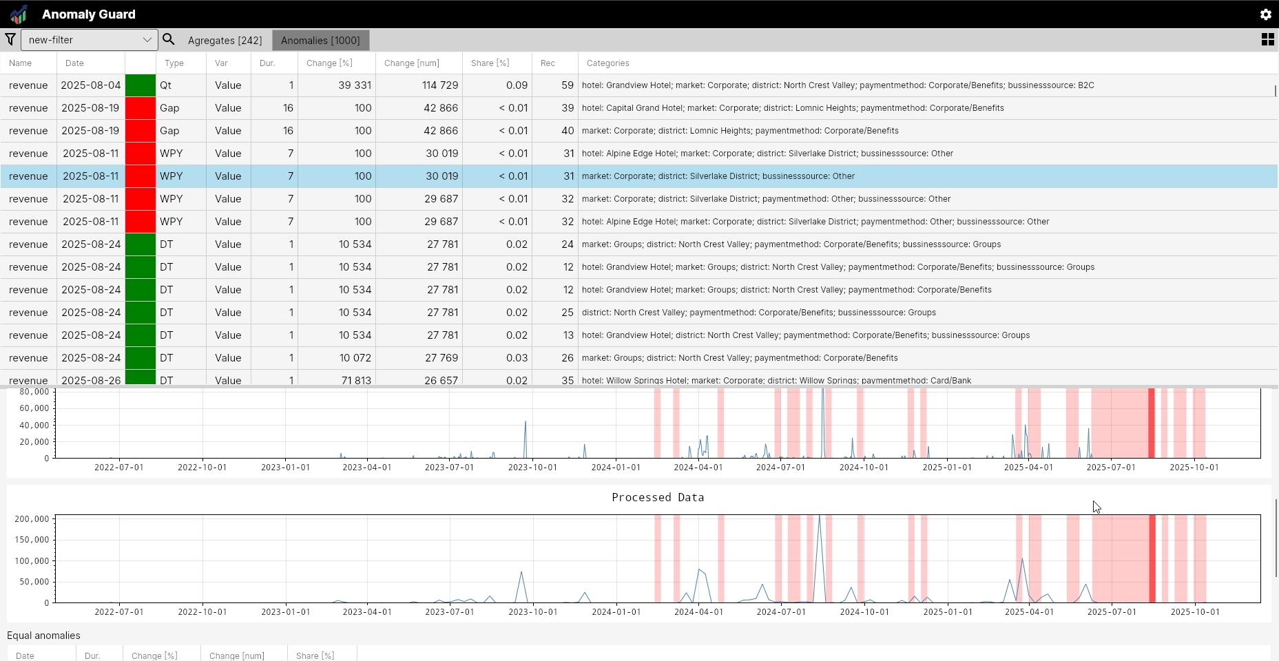
The homepage layout is flexible: side panels can be shown or hidden and moved to suit the user's needs.
With an understanding of the user interface you can proceed to the next chapter, Setup Your Analysis, which explains how to configure filters for repeated use inside or outside the application.