How to Setup Your Analysis
Intro
After the administrator has configured the analysis for selected Data Views, the end user can utilize their results. In this section of the documentation, we will look at how to do this.
In the following image, we see an example of two Data Views about hotel bed occupancy and total revenue in a hotel chain. Their detailed description is defined in previous chapters here and here.

From the image, it is clear that in the case of bed occupancy, AnomalyGuard searches for changes and anomalies in 34 combinations of district - hotel dimensions and, using the configured detector functions, found 6,451 anomalies. In the case of the DataView hotels:revenue, it searches for anomalies in 4,037 dimension combinations and found 341,225 using the configured detection functions. Both Data Views have a 3-year long time series of values.
If the user wants to analyze and display these results, they must have assigned access to these Data Views in User Administration.
Why use filters and aggregators over anomalies
The user's task is to prepare so-called "views" of these anomalies and changes on the homepage using filter settings. In principle, it's about preparing one or more filters that will filter out from this updated cloud of anomalies and identified changes those that are relevant for their position and responsibility - meaning they won't miss the important ones (false negatives) and conversely won't receive information about irrelevant ones (false positives). The application then aggregates these relevant ones so that in the end the user receives the top N insights they should look at, which will be quantified and sorted by priority so they can act immediately - so-called actionable insights.
Users prepare these filters on the AnomalyGuard application homepage. The filter is displayed as a side panel on the left side when clicking on the Filter icon button.
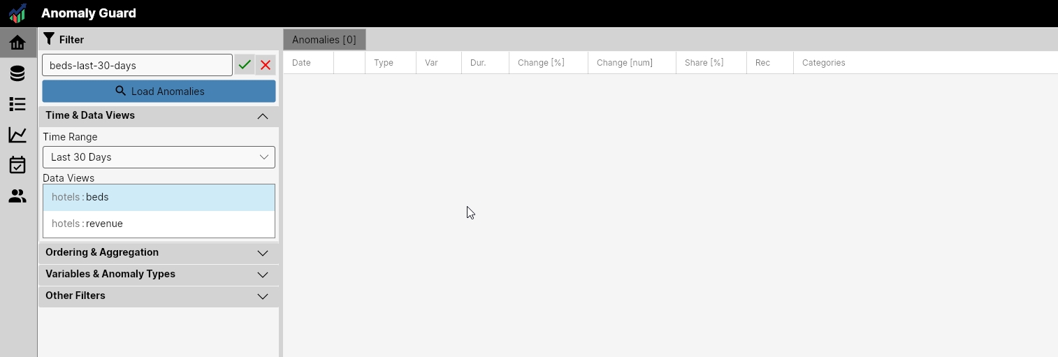
In the first row, a combobox with filter selection is displayed. If we click the Add button, a text box appears where we can define the name of a new filter and Apply - Cancel buttons. Below them is the Load Anomalies button, which allows us to display the filter results.
Filter settings are relatively complex. This is because we want to have the ability to define relatively precisely what we want to see. So that we always find all the important changes and, on the other hand, don't have unnecessary false positives in the results.
Filter setting complexity
When defining a filter, we can set a large number of parameters. However, we must be aware of what we are doing and what anomalies we include in one view, because with incorrect settings we can get contradictory results that ultimately don't make sense. For example, if in one filter we combine anomalies from different incompatible data views (sales, inventory changes, marketing data), from different variables (value, count, avg), or from different detection functions (spike, gap, mom, ...). Filter configuration is the user's responsibility and they should "play" with the results to see what results they get with different settings.
Filter settings are extensive, but their understanding is simple. They are divided into four sections - Time & Data Views, Ordering & Aggregation, Variables & Anomaly Types, and Other Filters.
In the following example, we will create a filter for anomalies and changes in hotel bed occupancy in the last 30 days. We have set the filter name to beds-last-30-days. Naming is up to you and you can set it according to your needs and data characteristics. We only recommend keeping names short and descriptive.
Time & Data Views
In the Time & Data Views section, we define the time range from which we want to display anomalies and select the Data Views we want to include. From the Time Range combobox, we select the time range from which we want to display data. In this example, we set the time range to the last 30 days. This is a dynamic filter that moves progressively. Within the combo box, we can choose from the following options:
"Custom", "Yesterday", "Last 2 Days", "Last 4 Days", "Last 7 Days", "Last 15 Days", "Last 30 Days", "This Week", "Previous Week", "Previous 2 Weeks", "This Month", "Previous Month", "This Year", "Previous Year"
If we use the Custom option, we must precisely define the date range and it no longer changes over time.
For the Data Views list box, we select those that interest us for the given filter. In this listbox, we usually select only 1 data view. This is to avoid combining anomalies meaninglessly, for example anomalies from inventory with anomalies from the revenue dataset.
Combining multiple data views makes sense, for example, if we have multiple data views over 1 data source, such as revenue per country & sales channel and revenue per country & product group. In this case, the combination makes sense.
In our example, we selected only 1 data view - hotels : beds. We continue in the Ordering & Aggregation section.
Ordering & Aggregation
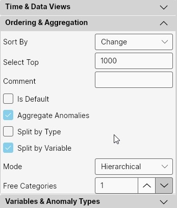
In the Ordering & Aggregation section, we define how to sort anomalies, how many to select (Top N), and whether and how to aggregate them. First, we define the sorting of anomalies. It is not optimal to pull all records from the database into the application, but only a portion of them, sorting them somehow beforehand by importance.
For this, we use the Sort By combobox. We can sort them by several parameters:
| Name | Description |
|---|---|
Duration |
sort by length of anomaly period (from longest) |
Date |
simple sort by anomaly start date (from oldest) |
SIN |
(significance index normalized) sorted by calculated "importance index" of anomaly, where the index is calculated from change - duration - category share values (from largest) |
SIM |
(significance index multiplicative) sorted by calculated "importance index" of anomaly, where the index is calculated from change - duration - category share values but also takes into account the frequency of the anomaly in the given category combination. If frequent, the index decreases. The index thus pushes new and less frequent anomalies to the forefront at the expense of repeated - known ones |
Anomaly Value |
sort by current anomaly value (from largest) |
Predicted Value |
sort by predicted non-anomaly value (from largest) |
Change |
sort by difference between predicted and anomaly value (from largest) |
Change % |
sort by percentage difference between predicted and anomaly value (from largest) |
Change Cum |
sort by total difference between predicted and anomaly value for the entire anomaly period, i.e., change * duration (from largest) |
Category Share % |
sort by percentage share of the given category combination on the total dataset value in the last 30 days |
When we have these anomalies sorted in the DB by the selected importance parameter, through the Select Top value we determine how many top N anomalies are pulled from the DB into the application. If the value is NULL, all are pulled. This parameter is essentially a helper to avoid pulling too many anomalies into the application unnecessarily and overloading the application. By default, we can leave this value somewhere in the range of 500 - 1000. Loading a larger number of anomalies usually doesn't make sense.
The next parameter is Comment. We use this parameter as a short and concise description of the anomaly filter. It is displayed in the upper right corner of the application when we have the Filter side panel hidden and also in the external visualization application Dashboard to describe what the user sees.
Using the Is Default checkbox, we define whether it is a so-called default filter, meaning after the application starts, it is automatically selected in the combobox for filter selection.
The remaining part of this filter section defines aggregation. If we want to aggregate anomalies, we set the Aggregate Anomalies checkbox to TRUE. Aggregating anomalies is useful to increase readability and understandability of results. It is always better to have, for example, 5 rows in the result than 40. An example could be aggregating anomalies of sales of 2 products in one store in one product group, or conversely 1 product in two sales regions. Aggregated anomalies also display results in aggregated form (e.g., category share). Even if we let anomalies be aggregated, we don't lose access to individual anomalies. Aggregates are displayed on a separate tab in the application homepage.
Anomaly aggregation methodology
The method of aggregating anomalies is relatively complex and we can also configure it in quite detail. After selecting individual anomalies, they begin to be aggregated on the backend.
First, according to the Split by Type (spike, mom, gap, ...) and Split by Variable (value, count, sum) checkboxes, they are divided (or not divided if the value is FALSE) into separate groups.
Subsequently, all anomalies in these groups are divided into further sub-groups - negative and positive, that is, those that have a positive or negative impact on the analyzed values and also according to Data Views.
In the next step, for each designated group of anomalies, so-called temporal clustering is performed via the DBSCAN function. This further divides anomalies into smaller clusters according to whether these anomalies are "temporally connected". This occurs especially if we have anomalies from a longer time period in the filter and the anomalies show temporally limited clusters.
Subsequently, anomalies are aggregated by categories. Here we can use two methods: hierarchical or graph-based aggregation. Their description is in the following text.
When we have created clusters of anomalies according to the previous settings, we can start aggregating anomalies by the categories in which they occurred. First, we must decide on the aggregation method. Through the Mode combobox, we can choose Hierarchical or Graph aggregation.
Simpler is Hierarchical aggregation. This is suitable if we have a small number of categories in which we are searching for clusters. Only one parameter is set here, Free Categories, which we usually leave at the default value of 1. This parameter indicates how many free categories can be in 1 aggregate. With a value of 1, if we have 3 categories (e.g., country, city, product), then in 1 aggregate there can only be anomalies that have 2 categories the same and 1 different (e.g., same country-city but different product or same product-country but different city).
With this setting, from the pulled anomalies, the application first determines the count of unique values in individual categories and then starts aggregating by the least numerous (e.g., country) and subsequently searches for the free category hierarchically in categories with higher counts of unique values.
This type of aggregation works very well if we have a small number of categories or we have, for example, hierarchical categories (e.g., country - region - city) combined with another type of category (e.g., product or sales channel).

With a larger number of categories, the results may not be ideal, and there we can use Graph aggregation.on. This type of aggregation is good if we have a larger number of categories or if we want to set preference for certain categories during aggregation. The application takes all anomalies and their aggregations. Subsequently, it creates a graph in them and searches for aggregates.
For it, we define the so-called Graph threshold, which defines the sensitivity limit at which anomalies still fit into one aggregate. The higher the value, the fewer anomalies in the aggregate and their connection must be stronger. With a lower value, conversely, more connected anomalies get into one aggregate.
Sometimes, however, we want some connections in the graph to be stronger - for example, we want values to be aggregated in the order Country - Region - City and only then by Sales Channel. We can set this through the Graph Weights parameter. Here we can set the weight of individual categorical connections. By default, the connection for each category is 1. If we want, for example, to predominantly aggregate first in the direction Country - Region - City, we set this parameter to:
`Country = 4; Region = 3; City = 1.5`
Individual settings for categories are separated by semicolons. It is best to test these parameter settings on real data that we want to analyze and test what setting generates the best aggregates.

According to the defined settings, the selected anomalies are aggregated in the application and then displayed. For our purposes for data view hotel:beds, we leave aggregation in the default setting (Split By Type = FALSE; Split By Variable = TRUE; Mode = Hierarchical; Free Categories = 1).
Variables & Anomaly Types
In the next section Variables & Anomaly Types, we select from two lists. In the Variables list, we select the variable for which we want to see anomalies. We can select one, or if it makes sense, several. In our case Hotel:Beds, we work with only one variable Count and therefore we select it.
In the second list, we can select Anomaly Types that will be taken into account in the result. By default, all types are selected. Here we can choose what is appropriate according to the use case. In our case, we have all anomaly types selected in the filter.

Other Filters
Finally, we have the last section Other Filters. Here we can define the rest of the filtering parameters in detail. Using the first parameter Categories Filter, we can filter anomalies at the category level.
Here we can define several categorical filters where each filter is separated by a semicolon and set as category = value. This way we can limit the anomaly list to a selected category - for example anomalies from Germany, or conversely, completely exclude a certain type of category from the list - for example City = NULL. Individual categorical filters work through an AND clause, meaning the anomaly must meet all defined categorical filters.
Using the Anomaly Result list, we can select what type of anomalies we want to see: anomalies with positive impact, negative impact, or both types.
Finally, there remain several other parameters through which we can filter anomalies via min / max values of Anomaly Recurrence (how many times the anomaly appeared in a given category combination), Change [%] (percentage change between predicted and real value), Change [num] (value of difference between predicted and real value), and Share [%] (share of the given category combination on the total value of the observed variable in the last 30 days).
We use these last parameters when we want to define the filter detail. For example, we want to see only anomalies that are not regularly repeated (Anomaly Recurrence < 5) or the minimum anomaly in sales is more than 500 USD (Change [num] > 500).

After setting all filter parameters, we click the Load Anomalies button. The application, based on the defined filter, pulls from the defined period the Top N anomalies for selected Data Views and specified anomaly parameters. These are aggregated according to settings and displayed in the application.
Examples
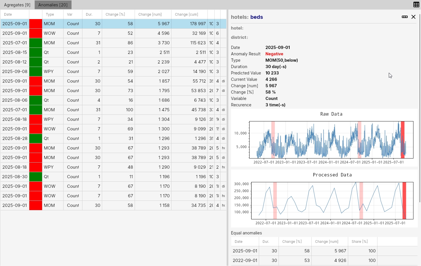
These anomalies are then displayed in two tabs - Anomalies and Aggregates. The following image shows an example of the result for the defined filter "all anomalies from last 30 days for data view Hotel:Beds". We see that 20 anomalies were selected from the database and they could be aggregated into 9 aggregates (insights).
The anomaly table displays results for individual anomaly events. For example, the first row shows an anomaly that started on 2025-09-01 and lasted 30 days. It was a MOM anomaly (month over month), it was a decline in the month-to-month value (red color). The change between months was a 58% decline (numerically a drop of 5967 beds on average per day). The cumulative value of the decline for the entire 30-day period was 178,997 beds. Categories is empty, so it was an anomaly on the overall dataset. Therefore, the share value is 100%. This type of anomaly (mom) occurred 3 times on the given dataset in the observed 3-year period.

In this way, we have anomalies identified, quantified, and displayed by importance. If we double-click on a selected row in the table, detailed information about the anomaly is displayed - that is, all parameters, and we can also display this anomaly on real (daily) and possibly also recalculated (in this case monthly) values. In the graph, the current anomaly is displayed in a more intense color and other same anomalies on our dataset in a lighter color.
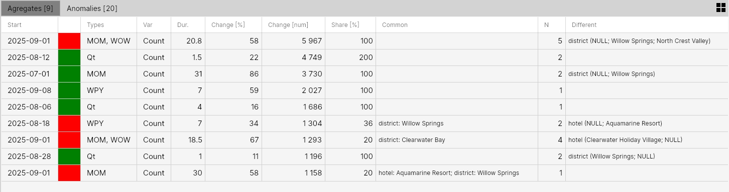
If we switch to the Aggregates tab, we see how the application aggregated individual anomalies. From 20 individual anomalies, it generated 9 aggregates (complex insights).
Here, for example, we see in the first row a negative anomaly that started on 2025-09-01. It was identified through the detection functions MoM and WoW (month-over-month and week-over-week) on the Count variable. The average duration of the anomaly was 20 days. Values for change and share are displayed in the table. For categorical values, we have 2 columns reserved - Common and Different.
Common is empty and different contains only the District category. This means that it aggregated anomalies that were identified at the district level. Individual district categories are displayed in brackets. Here we see real values and also the so-called NULL value.
This means that these anomalies were identified on values in these categories and also on data where this category was not used when filtering input data. Since the common column is empty, it was about overall data. Finally, column N shows that 5 unique anomalies got into the aggregate.
For example, row 6 shows another aggregate where the decline defined by MoM and WoW functions was defined in the Willow Springs district. In this district, the anomaly was defined without an identified hotel (hotel = null) and also in the hotel sub-category Aquamarine Resort. We can understand this display as the anomaly being found in 1 main hierarchy (District = Willow Springs) and 1 sub-hierarchy (District = Willow Springs; Hotel = Aquamarine Resort). This table thus shows us a very compact view of changes in the monitored dataset.
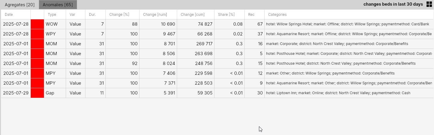
In the next example, we will make a slight adjustment to the same filter. We want to see only anomalies at the district level. We don't want to analyze them at the level of individual hotels. Also, we are only interested in negative declines in occupancy.

For this case, we set Categories Filter to hotel = NULL and in Anomaly Result we select only the Negative item. The result is shown in the following two images.

In the case of the anomaly table, we found 13 anomalies in the given period of the last 30 days, and these could be aggregated into 2 aggregates. In both cases, these are anomalies identified through comparison with the same period in the previous year (MPY, WPY) and represent a decline of 24 - 29%.

In the next example, we looked at the Data View Hotel:Revenue in the last 30 days. Anomalies for this Data View were sorted in the specified time range by average daily anomaly size (Change) and we displayed the TOP 700 anomalies. As we see, the number of anomalies for this Data View is higher. This is because we analyze anomalies using multiple detection functions and also because the number of combinations of individual categories is higher.
After their hierarchical aggregation, we got 171 aggregates, which is still a lot for manual analysis or reviewing identified changes. Therefore, it is necessary to set the filter more sensitively according to the use case.
Filter setting sensitivity
The ideal filter setup is one that gives us about 10-15 aggregates in the result, because if there are more, we lose grasp of their significance. For some use cases, it is also good to set the filter so that in most cases it displays no anomalies - meaning we limit the amount of false positives, especially if this data enters as input via API into other company processes.
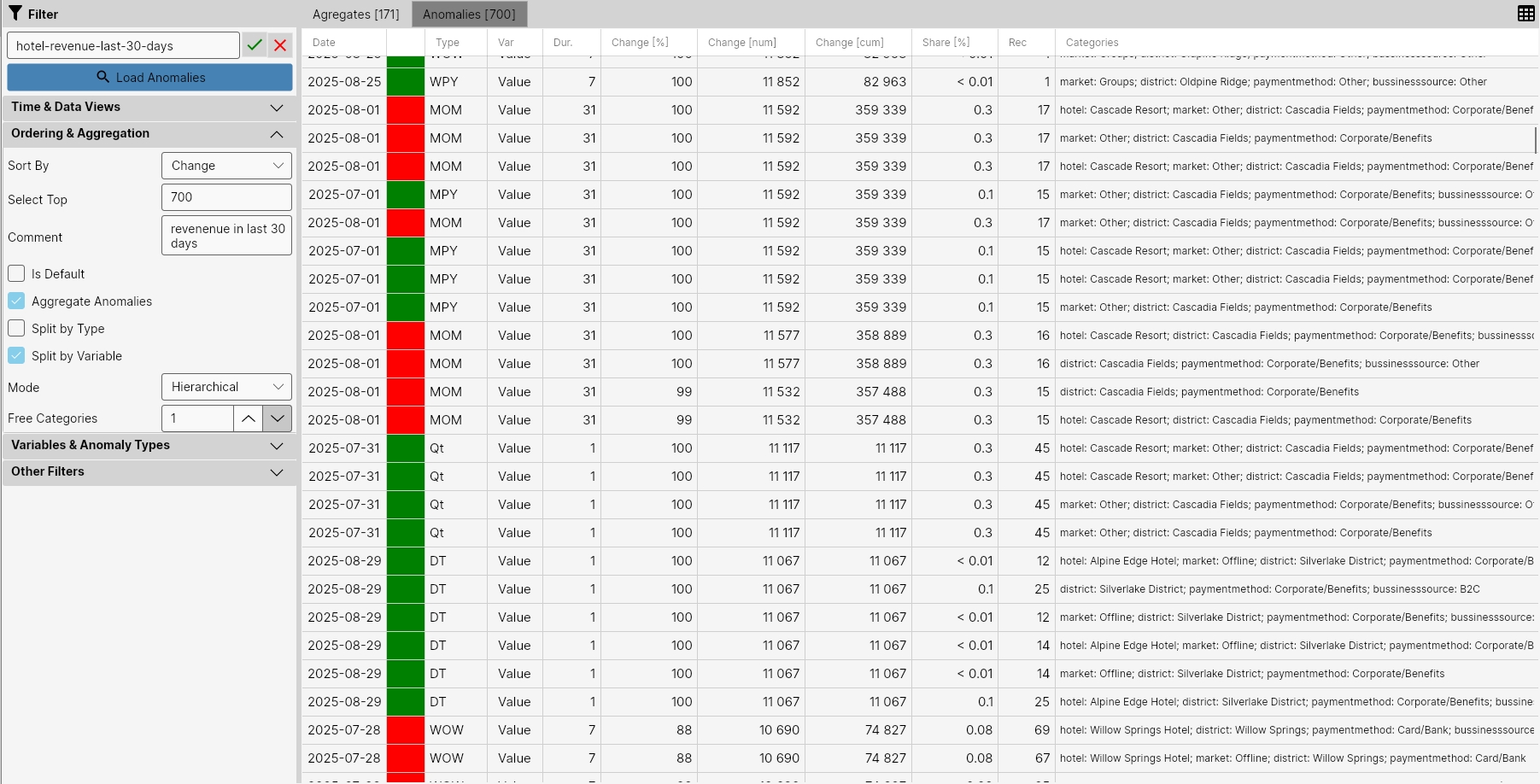
In the next step, we removed from the analysis anomalies that are below our resolution threshold. We set this threshold to anomalies where the anomaly in revenue (Change [num]) represented more than 5000 USD. Smaller anomalies are therefore not considered relevant.
In the result, we subsequently see 234 anomalies, and from them it was possible to create 59 aggregates or insights. This amount is already more readable but still too high.
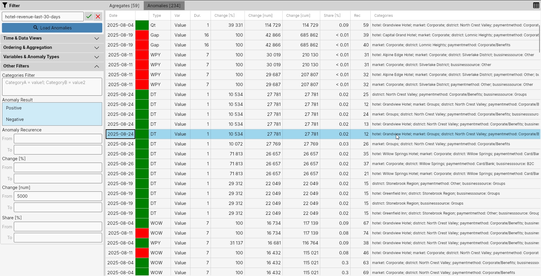
Therefore, in the next step, we filtered out from the anomalies those that are from an irrelevant dimension for us - BussinessSource. We did this through Categories Filter with the setting bussinesssource = NULL.
By this, we ignored all anomalies where this category appears as a category. This reduced the number of anomalies to 65 and the number of created aggregates to 31.

In this way, we can continue until we see in the result a number of anomalies and changes that is relevant for our use case. We can further "play" with the selected anomalies at the aggregation level. For Data View Hotels:Revenue, we see a larger number of categories, some of which are more important than others. For example, it is more important to aggregate anomalies first by categories District and Hotel and only then by categories PaymentMethod, BussinessSource and Market. We can also imagine a higher level of aggregation of individual anomalies.
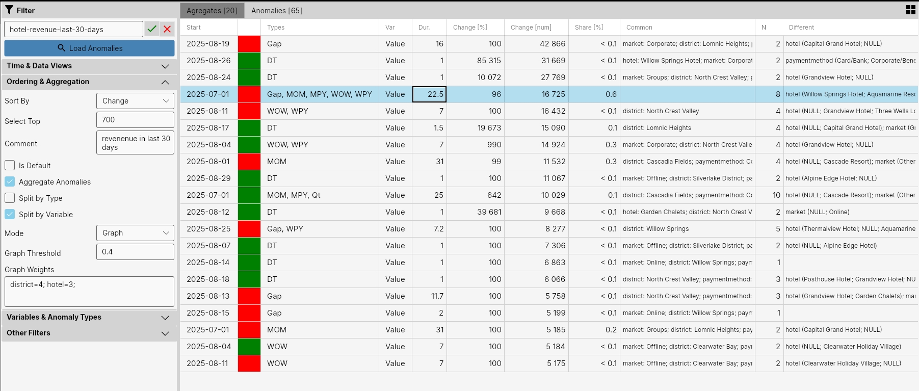
For this purpose, we will try to change the aggregation type and set the Mode parameter to Graph. To increase the significance of the district and hotel dimensions, we set via the Graph Weights property to district = 4; hotel = 3. We leave Graph Threshold at the default value of 0.4.
According to the results, we can then iteratively change these values until the result is satisfactory. In the result, we see that the number of aggregates decreased from 31 to 20 and makes more sense for the character DataView Hotels:Revenue.
Similarly, as in the case of individual anomalies, if we double-click on a selected row in the table, a side panel with detailed information is displayed. Here, for example, we see all values summarized. In a separate table, for example, we see statistics of all numerical values (Duration, Change, and Share). These are displayed for all anomalies as Avg, Min, Max, and Base Value. We also see the total number of aggregated anomalies in the form of their total count and the count of so-called Base Anomalies.
What is a Base anomaly
In all anomalies, the application always tries to find so-called Base anomalies - meaning anomalies of a higher hierarchical level. If we have, for example, 3 categories and in the aggregate we have 1 anomaly for which some category has a NULL value, it is a so-called higher-level anomaly. This anomaly is therefore considered a so-called base anomaly.
An example could be decline anomalies in one district for multiple hotels. If we don't have an anomaly that would be identified for district = value and hotel = null, all individual anomalies are considered base and in the table their cumulative sum is used as the base value (except for the duration parameter). We then see this base value also within the values in the main Aggregates table.
But if we have this anomaly also in the dataset where hotel = null, this anomaly is recorded as a higher hierarchical level anomaly and then the value from this anomaly is displayed as the "base value".
If there are multiple base anomalies in this category combination (for example for the Mom or WoW detection function), the values for the base anomaly are selected where the value of the normalized significance (SIN) index is highest.
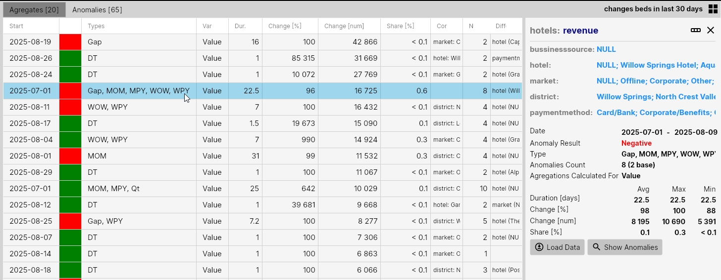
If we click the Load Data button in the side panel of the aggregate detail, the aggregate is also displayed on the course of real data for the Base anomaly. If we click the Show Anomalies button, only anomalies from the selected aggregate are displayed in the table on the Anomalies tab. Here we can review them in more detail.
Another example shows the analysis of so-called spikes. That is, anomalies of immediate sudden and sharp changes. For this analysis, we use hotel revenue from the last 30 days as well, while in the Variables & AnomalyTypes section we selected those detection functions that identify this type of change.
These are AnomalyTypes DoD (day-over-day), Spike (complex spike detector), and DT (dynamic threshold). These three types of detection functions should be able to detect all these sudden changes. With additional filtering parameters, we could specify them even more (e.g., minimal value of Change [%]).
In the result, we see 335 such sudden changes in the last 30 days, all of which were positive. In the result, they could be aggregated into 99 events.
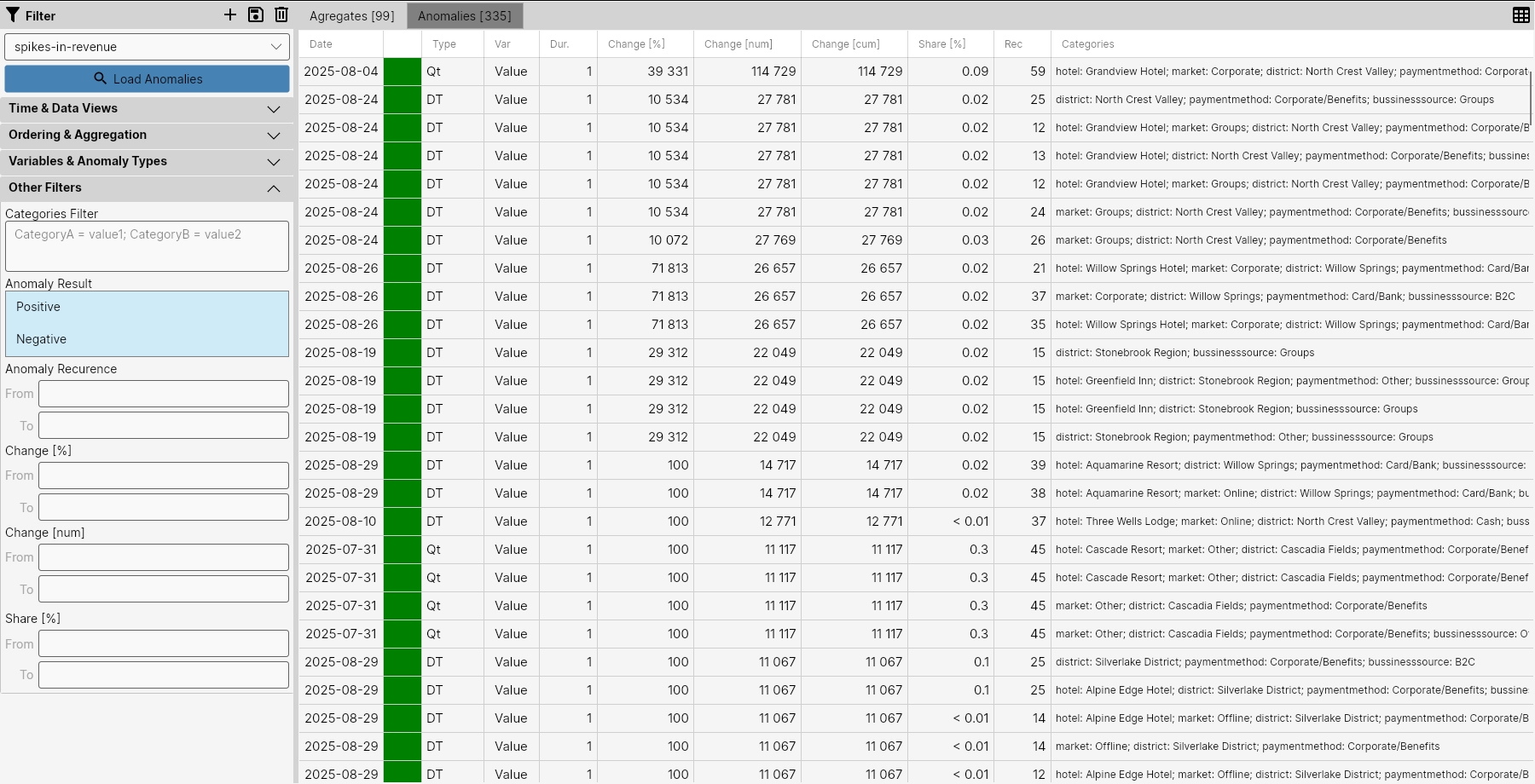
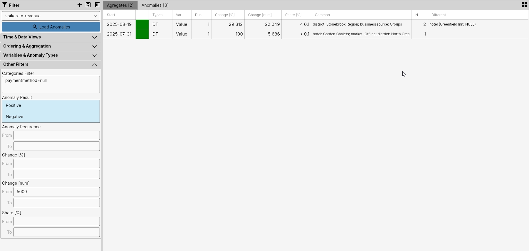
To get a smaller number of these anomalies, we filtered out all anomalies that related to the PaymentMethod category, and in the result we obtained 3 such sudden anomalies, which could still be aggregated into 2 events. Their description is in the table in the following image.
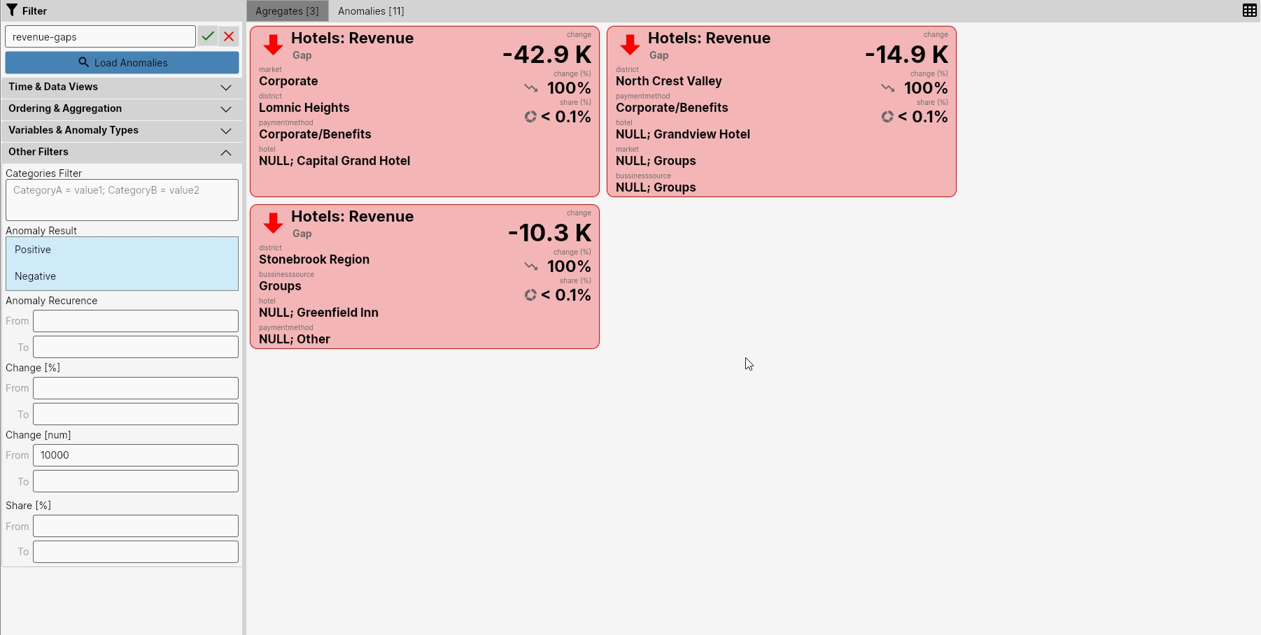
The next image shows the last filter example. In this example, we analyzed only anomalies defined by the Gap detector - meaning finding dropouts in revenue. For this case, we found dropouts in 3 aggregates in the range from 10 to 43 thousand. These were dropouts for the following base categories
- market: Corporate; district: Lomnic Heigths; payment method: Corporate/Benefits
- district: North Crest Valley; payment method: Corporate/Benefits
- district: Stonebrook Region; bussiness source: Groups
Overall, however, these are relatively small dropouts because these category combinations constitute less than 0.1% of the total average daily revenue in the last 30 days.
In this way, the user can define their filters in the application - that is, views over anomalies and changes in data that will be relevant for their position in the company.
The results can then be consumed in this environment, as well as in the built-in, simpler and visually friendlier AnomalyGuard Dashboard environment, or in another company application or environment (internal systems, email alerts, BI tools, ...) through the built-in REST API interface.
In the next part of the documentation, we will present the mentioned AnomalyGuard Dashboard, where we can easily and quickly consume results through prepared filters.